Everything you need to turn
design feedback into progress.
CritiqueFlow brings review, analysis, collaboration, tasks, and iteration into one visual workspace.
Smart Design Scan
Drop a design and CritiqueFlow automatically detects spacing, alignment, contrast, and accessibility issues — each pinned to the exact location on the canvas.
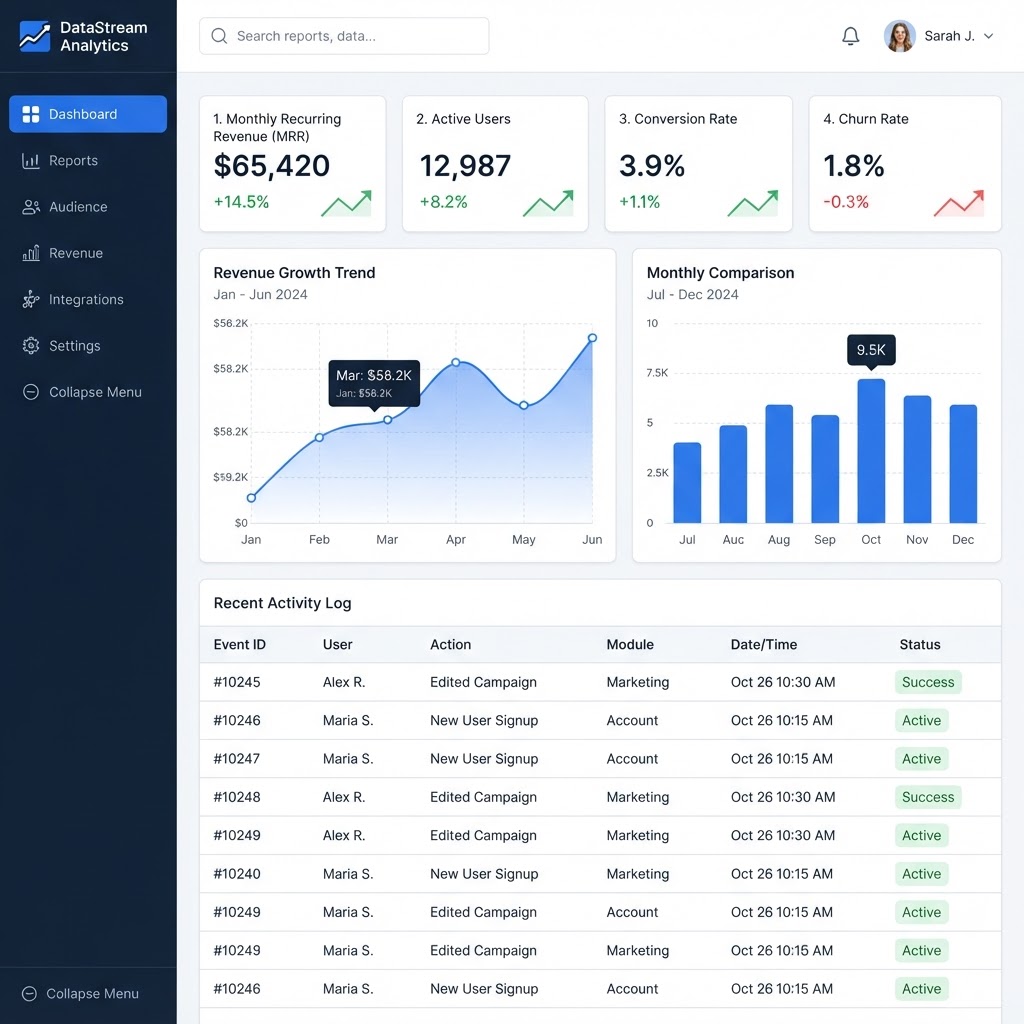
Inconsistent card padding
Cards use 12px, 16px, and 20px padding inconsistently across the layout.
Standardize all card padding to 16px.
ALL DETECTED ISSUES
AI Design Critique
CritiqueFlow analyzes your design across six professional review categories — each with severity, explanation, and a concrete suggested fix.
Layout Critique
2 issues detected · Severity: High
Weak visual hierarchy
The primary action does not stand out from secondary elements, making it unclear what users should do next.
Increase the primary CTA size by 30% and use a contrasting color.
Inconsistent grid alignment
Content blocks deviate from the 12-column grid, creating visual instability.
Align all content blocks to the grid system.
Visual Feedback Pins
Click anywhere on the design to drop a pin. Each pin captures category, priority, author, status, upvotes, and threaded replies — all anchored to the exact pixel.

Heading hierarchy is unclear — H1 and H2 are too similar in size.
DISCUSSION
Heading hierarchy is unclear — H1 and H2 are too similar in size. Users can't distinguish sections at a glance.
Agreed. I'd suggest increasing the H1 to 32px and keeping H2 at 20px. That gives a clear 1.6x ratio.
I can take this on. Will have a revised type scale ready by tomorrow.
Threaded Discussions
Every pin has its own discussion thread. Reply, mention teammates, upvote, resolve, and reopen — all without leaving the design canvas.
Heading hierarchy is unclear — H1 and H2 are too similar in size. Users can't distinguish sections at a glance.
Agreed. I'd suggest increasing the H1 to 32px and keeping H2 at 20px. That gives a clear 1.6x ratio.
I can take this on. Will have a revised type scale ready by tomorrow.
Status changed: Open → In Progress
THREAD FEATURES
Feedback Becomes Tasks
Convert any feedback pin into an actionable task with one click. Assign, prioritize, set due dates, and track progress from Open to Resolved.
Design Health Score
A deterministic score out of 100, calculated from real feedback data across six categories. Hover any category to see what's affecting the score.
Good
15 open · 14 resolved
CATEGORY BREAKDOWN
Feedback Heatmap
A density visualization reveals where feedback clusters. Hotspots show exactly which areas of the design need the most attention.
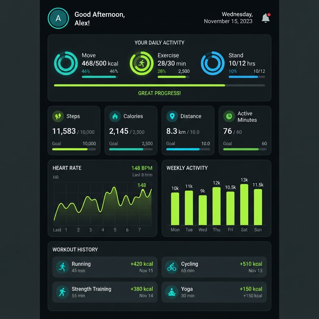
Click a hotspot to inspect the feedback behind it.
Annotation Tools
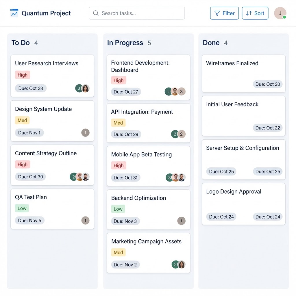
Mark up designs directly with arrows, rectangles, circles, highlights, and pin markers. Every annotation stays anchored to the design.
Version History Timeline
Every upload creates a new version. Track changes, feedback counts, and health scores across iterations — all on an interactive timeline.
VERSION
V4
Final polish
DATE
Sep 21
FEEDBACK
2
items
HEALTH
91
/ 100
CHANGES
Standardized spacing and button styles across all sections
Before / After Comparison
Drag the slider to compare two versions side by side. See exactly how feedback, health, and design quality changed between iterations.


FEEDBACK
HEALTH
LAYOUT
ACCESSIBILITY
CONSISTENCY
Design Consistency Checker
CritiqueFlow scans for inconsistent patterns across your design — button styles, typography, colours, spacing, and border radius — and suggests a unified standard.
Button radius
MediumSuggested Standard
Use 8px radius consistently
Body text size
HighSuggested Standard
Use 14px body text consistently
Card padding
MediumSuggested Standard
Use 16px padding consistently
Primary color
LowSuggested Standard
Use a single primary color token
Actionable Review Tasks
Tasks linked to feedback pins move from Open to In Progress to Resolved. Every task shows its source, assignee, priority, and due date.
To Do
Add focus rings to all interactive elements
Standardize button border-radius to 8px
In Progress
Fix heading hierarchy — H1 to 32px, H2 to 20px
Increase body text to 14px minimum
Done
Darken secondary text for WCAG AA contrast
Align action buttons to right edge
Team & Reviewer Modes
Four project roles control exactly what each person can do. Owners manage everything, Designers upload and edit, Reviewers give feedback, Viewers observe.
Owner
5 capabilities
The Complete Workspace
Six interconnected sections bring your entire design review workflow together. Navigate between them to move from review to resolution.
Design
Review designs with pins, annotations, and heatmap overlays

30 Project Gallery
Real demo projects across finance, healthcare, education, ecommerce, travel, music, gaming, analytics, and more. Click any design to view it full-frame.
THE CRITIQUEFLOW LOOP
One continuous loop from
feedback to progress.
Upload
Drop your design into the canvas
Analyze
Smart Scan detects issues automatically
Critique
AI generates structured design critique
Discuss
Thread feedback directly on the design
Assign
Turn feedback into actionable tasks
Fix
Apply changes and upload a new version
Compare
Slide between versions to see progress
Improve
Watch your design health score climb
Stop collecting feedback.
Start moving designs forward.
CritiqueFlow turns scattered feedback into clear, actionable progress.
No account needed · All data stays on your device · Free forever